In the Spring 2020 semester, RIT Players planned to put on a production of Little Shop of Horrors. The directors wanted a grungy, 80's feel for the tee-shirts, so band shirts and skater aesthetics were used for inspiration.
Process
I wanted to include imagery of the main antagonist of the show, the plant, Audrey 2. My original sketches and ideas included cropped pictures with the textual information integrated into the design instead of being a separate piece as commonly seen on production shirts.
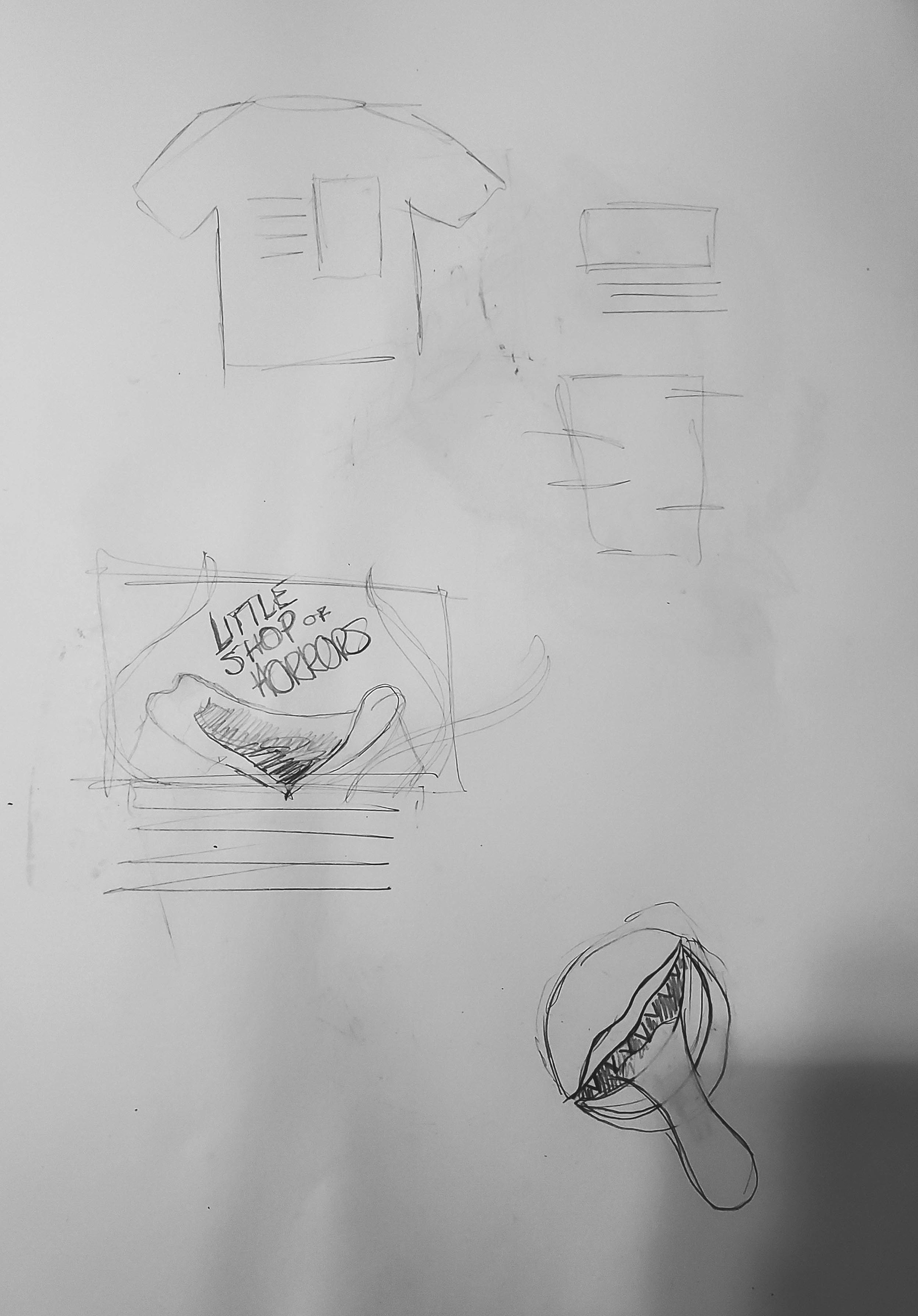
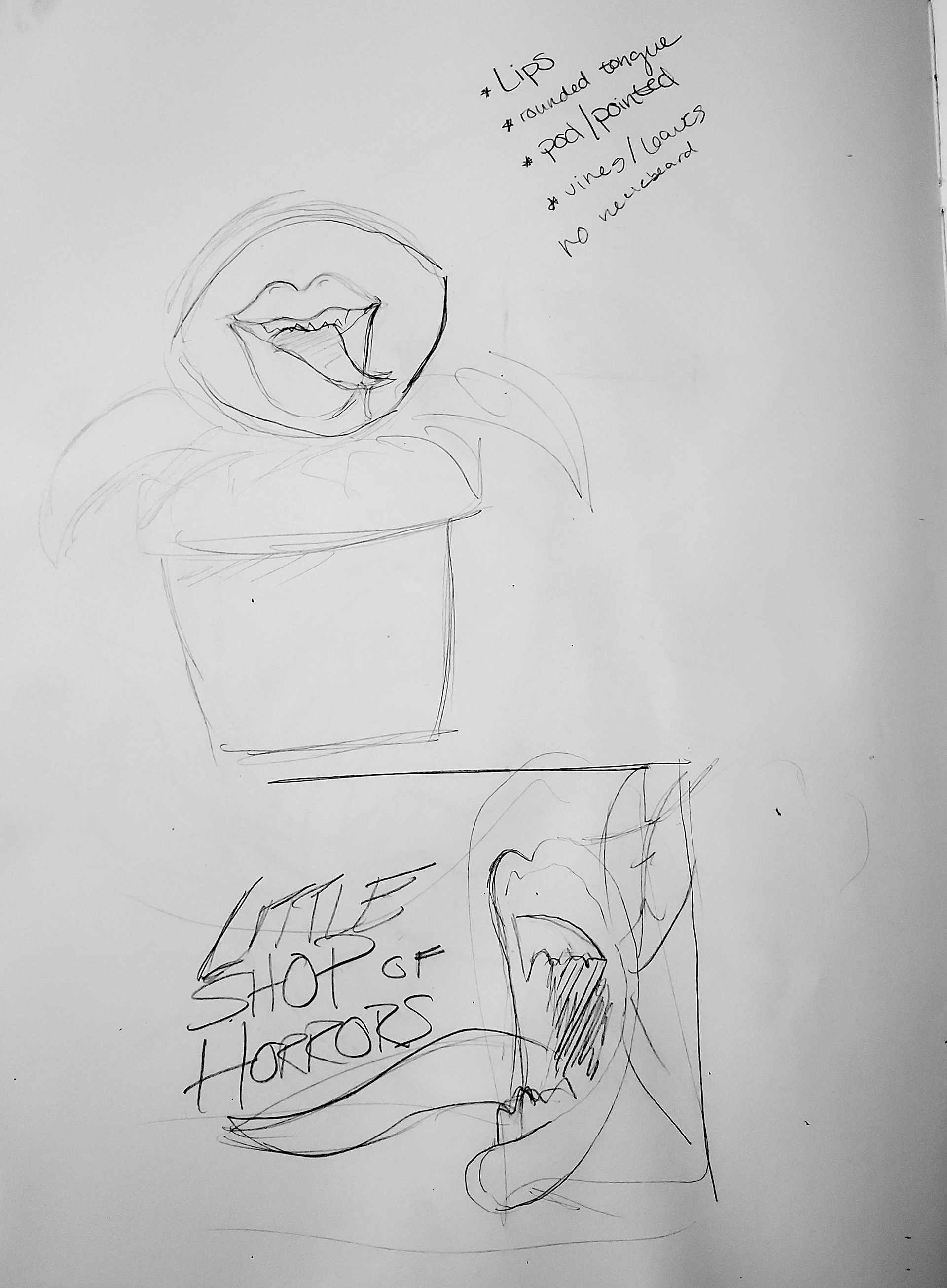
My moodboard helped me bring together the style I was trying to capture before I started. I shared these concepts with the show director before moving forward with my design, and with their feedback, decided that a full scale graphic would be the best direction.
Sketches

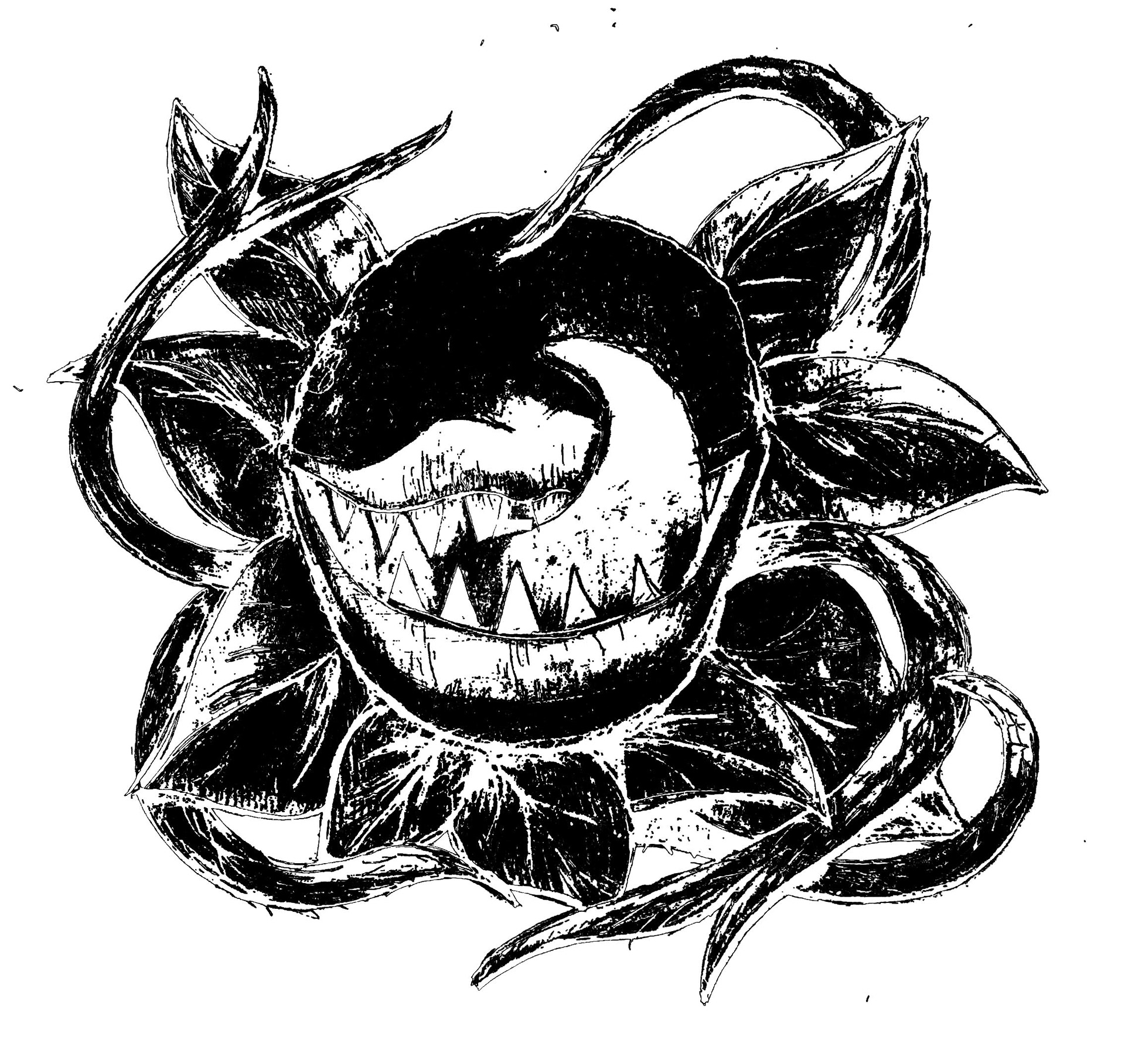
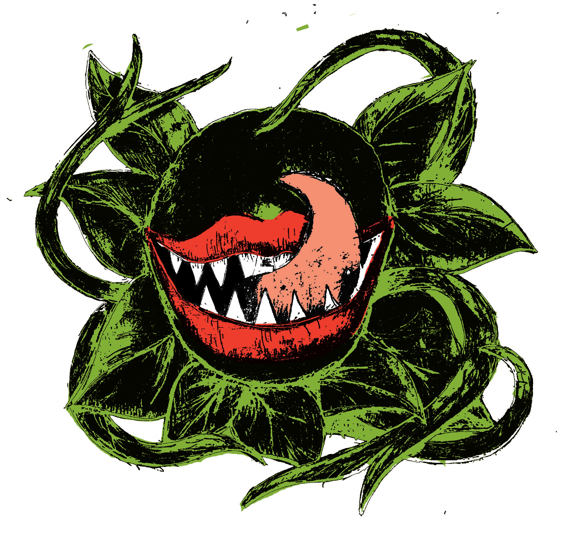
When choosing color, I was working with 2 other designers who were creating the stickers and posters for the show. Each promotional element was in a different style, but we wanted to have cohesion through color. It was a challenge to find a red and green that didn't read as too "christmas-y," but in the end we found a combination that we were all happy with.
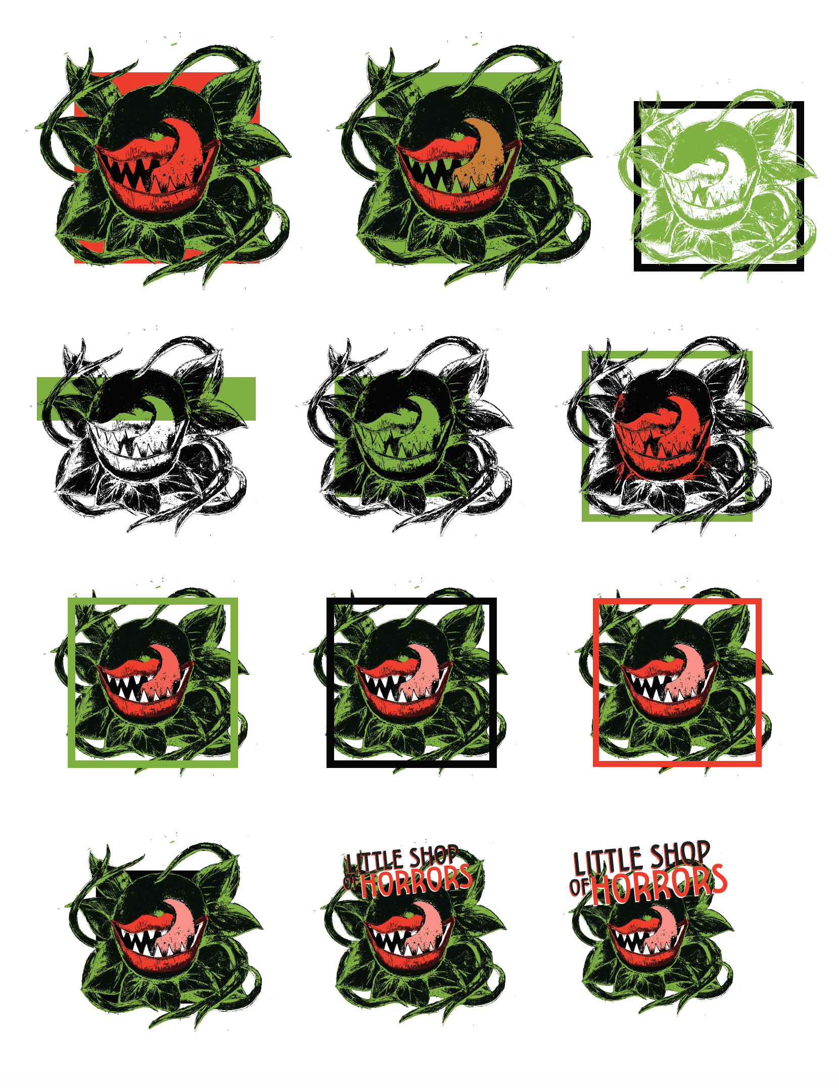

I put together as many combinations of the graphic and title as I could and then mocked the best up on tee-shirts. I presented them to the production team and the cast voted on their favorites. Unfortunately, due to the 2020 COVID-19 pandemic, the shirts were never put into production.

