This project is a concept piece for the purpose of redesigning the iconography at the Strong Museum of Play in Rochester New York.
Process
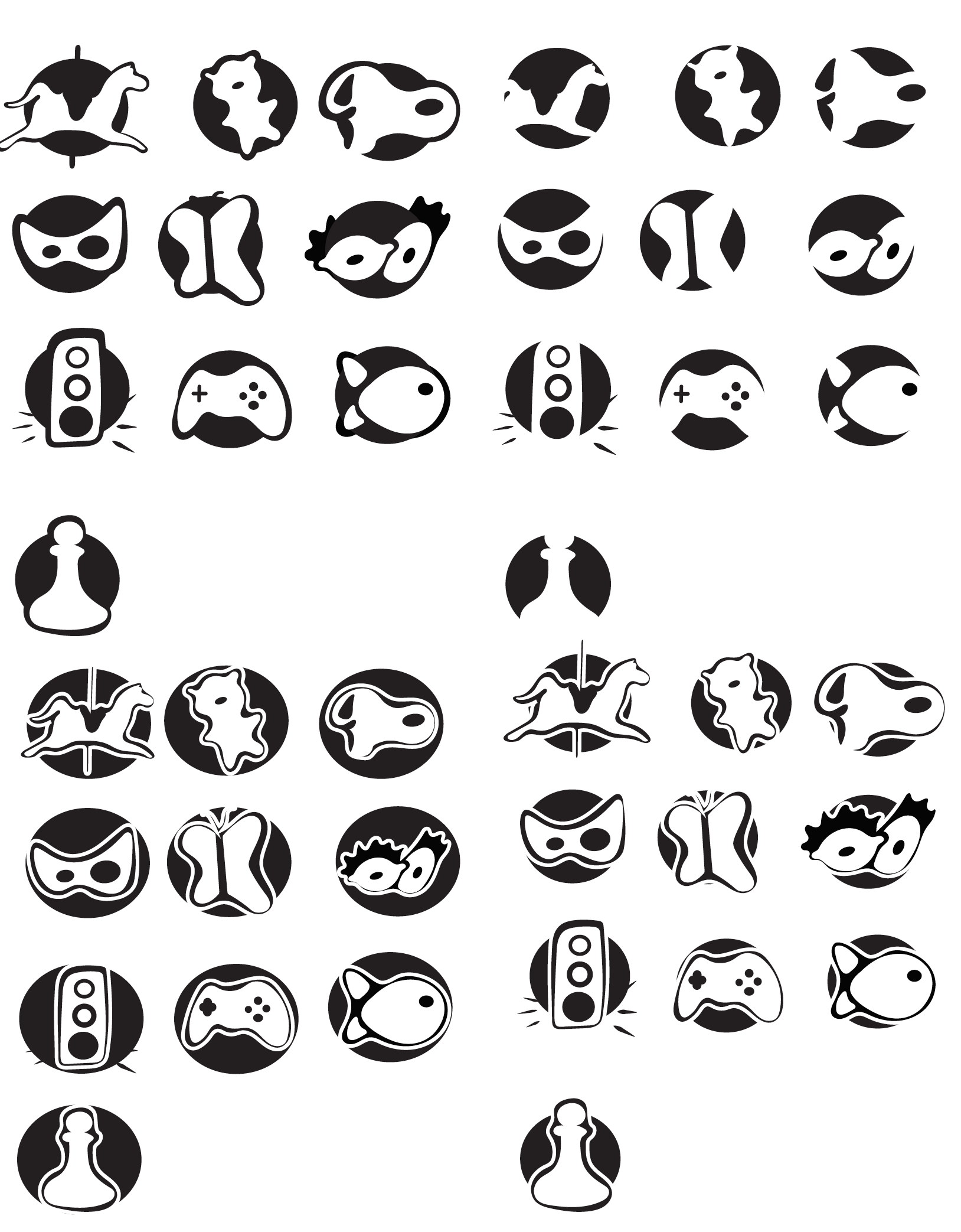
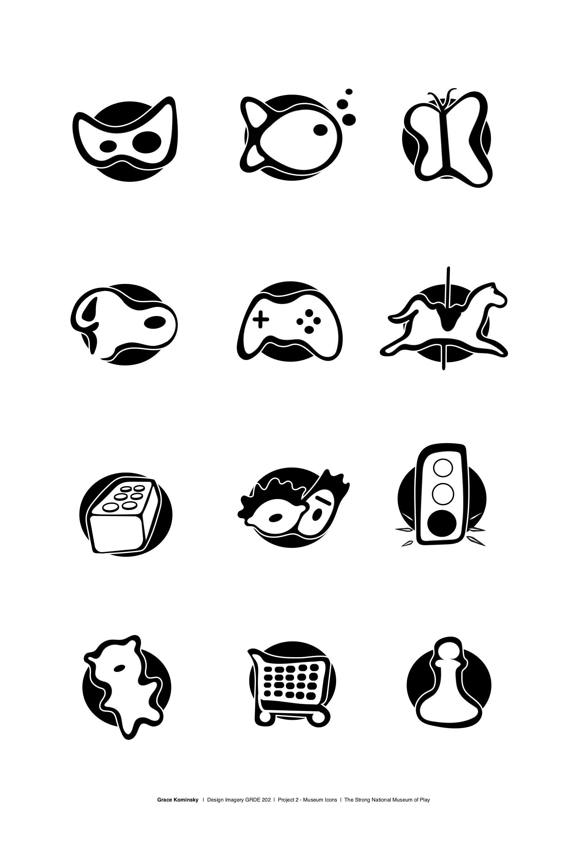
The Strong has 26 exhibits, but for this project I chose 12 exhibits to create new icons for. The purpose of creating these icons was to make it easy for visitors who speak any language to find the exhibit they're looking for. Some exhibits, like the Butterfly Garden, had very straightforward imagery. Others, like Build, Drive Go! presented more of a challenge when deciding what imagery to use.
I tried to emulate the childlike feel of the museum in my designs. In my research, I found that a lot of the exhibits have historical context as well as a hands on element. I wanted my icons to have a tactile feel while still capturing the purpose of the exhibit. One challenge I faced was simplifying the icons enough and making them cohesive while still keeping them legible. The 2 icons that challenged me the most were the Carousel and the Sesame Street icons. Designing imagery that fit my system while still reading as those themes took a lot of trouble shooting and feedback from users.
In the end, the icons needed to be in black and white, so I tried many different versions of outlines to find what was the most legible. Adding the black circle behind the outlines helped to make the system more uniform.